Equipment: Motospeed CK62, 40A-R 0.4mm damping rings, NPKC white-and-purple 61-key blank keycaps.
After working from home in 2020, I began thinking about how to boost my productivity. To achieve this goal, I needed to optimize my professional skills. Although I’ve been using Vim for work for a long time, my cursor movement and typing speed were quite haphazard and disorganized. So, to improve my efficiency, I urgently needed to get a tool to correct my typing technique—definitely not just to splurge on something.
|
|
| Motospeed CK62 Just Arrived | Place your hands on it to use as a scale |
My priority was simply to get a tool to correct my typing habits; features like backlighting or key travel were secondary. As shown in the image above, I bought this no-name blue-switch mechanical keyboard online for less than $50 during a sale.Since Vim requires keeping both hands on the 60% main key area as much as possible—completely eliminating the raised arrow keys, the “six-pack” keys, and the numeric keypad—I chose this 61-key 60% keyboard.
This keyboard uses the notoriously loud blue switches, often dubbed the “office friendship destroyers.” Since I bought a full-size mechanical keyboard with Cherry MX Blue switches a few years ago for gaming, I have a strange sense of familiarity with them.that distinct click-and-decent sensation when the key reaches the mid-stroke, accompanied by a sharp “click” from the mechanical switch, and the satisfying thud and sound when the keycap hits the bottom of the keyboard—it’s easy to get hooked on that typewriter-like feel.
|
|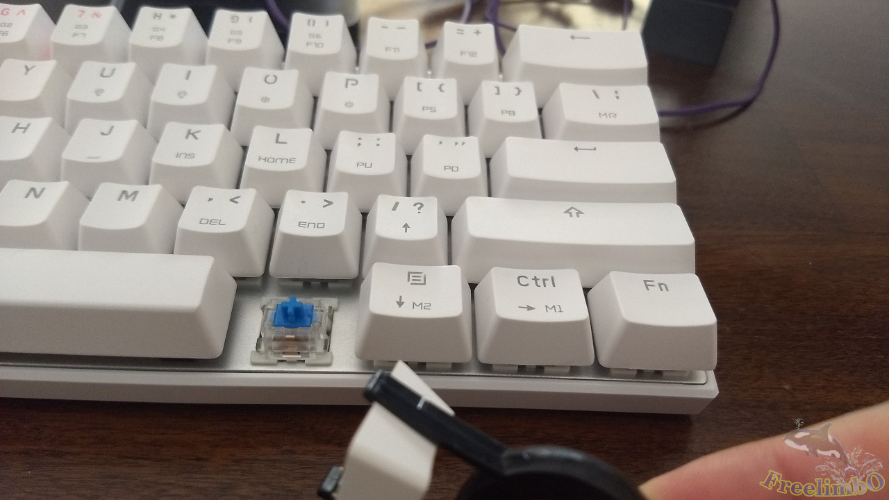
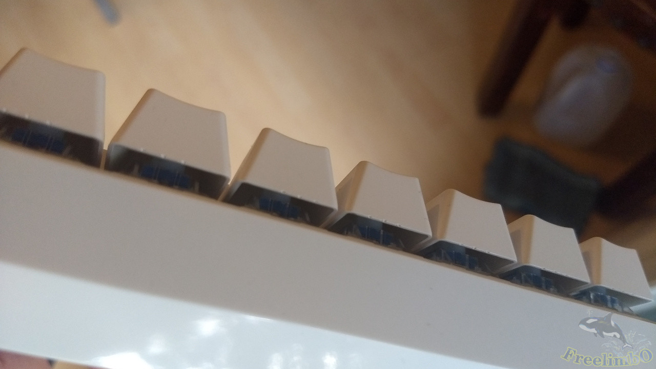
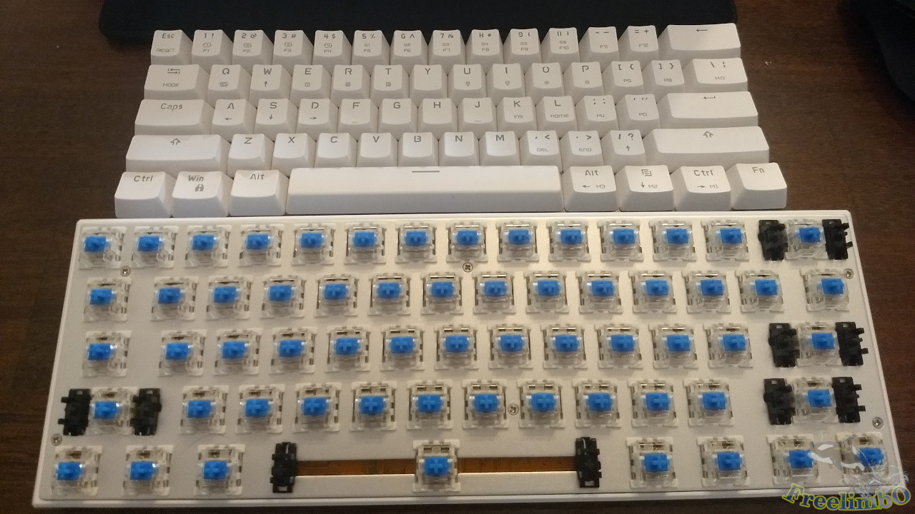
| Side view: Keycaps show mold marks | Removing the keycaps reveals the Outemu Blue switches |
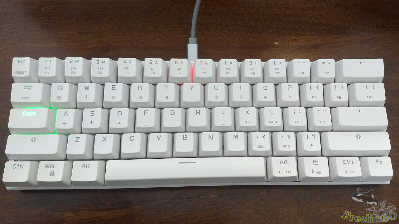
Let me briefly introduce this keyboard. It connects to the computer via a USB-C port located at the center of the front edge. This is a definite plus, as USB-C ports and cables are becoming increasingly common. Using micro-USB would feel a bit outdated, and if it still had a non-removable cable design, it might as well be a keyboard from the Qing Dynasty.Next, the keyboard’s back doesn’t allow for height adjustment, which is a minor downside. However, since the keyboard’s thickness is sufficient for my needs, I’ll overlook that. The sides of the keyboard have no bezels—this is the floating keycap design I prefer (see top-left image)—and the LED lighting instantly adds a sci-fi touch.Finally, looking at the front, the stock keycaps are made of translucent ABS via a two-shot molding process. Seeing the LED lights is pretty cool, but since I bought this to practice my typing technique, too much light pollution just distracts me. For me, this single-LED design is actually a bit of a nuisance.Now for the most important aspect: the typing feel. My recommendation here is not recommended. As a cheap, no-name keyboard, its blue switches are definitely not Cherry MX Blue switches; instead, it uses Outemu switches I’ve never heard of (see top-right image).You can clearly feel wobble from side to side throughout the entire key travel. The mechanical click in the middle of the stroke is even higher-pitched than that of Cherry MX Blue switches—it’s a bit shrill and noisy, unlike the crisp, pleasant sound of Cherry MX Blue switches. After prolonged use, this cheap keyboard is likely to make you feel irritated and restless.
Online reviews are almost unanimously negative, with the main complaint being the sluggish process of switching keyboard layouts. However, I rarely switch layouts myself. I just wanted a cheap 60% Blue Switch keyboard for Vim coding. If I need keys not present on the main keyboard, I use key combinations to get the job done, so I ignored this flaw and went ahead and bought it anyway.
|
|
| Size comparison with Magic Keyboard Ver. 1 | Size comparison with Cherry 100% keyboard |
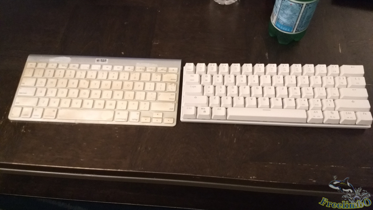
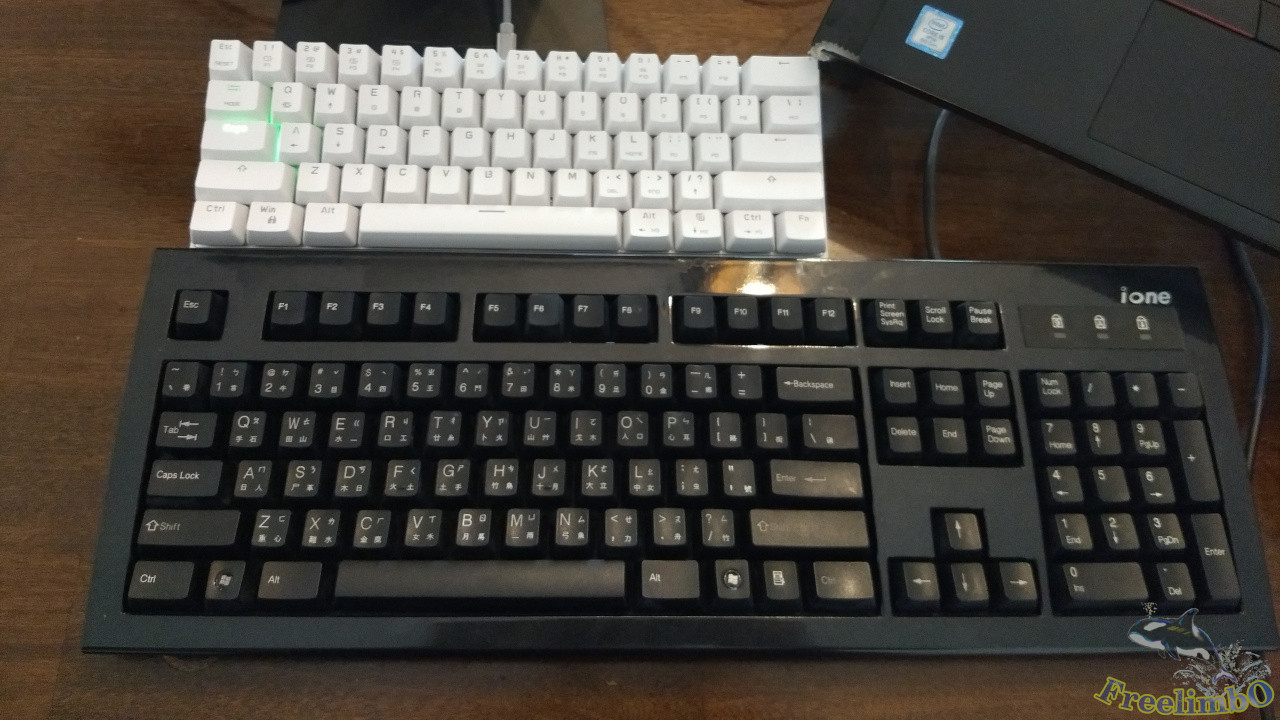
Next, let’s compare the sizes of the other keyboards I own. The one on the left in the top-left image is the first-generation Apple Magic Keyboard, which features a raised arrow key cluster and 12 function keys (I use this to force myself to avoid using the arrow keys).The full-size 101-key keyboard at the bottom of the top-right image was my first mechanical keyboard. It uses Cherry Blue switches, features Zhuyin and Cj-Symbol layouts, and is massive—it takes up a lot of desk space. Clearly, this newly acquired 61-key 60% keyboard doesn’t skimp on the main typing area compared to my previous two main keyboards, so I can tell this change won’t make my fingers feel cramped.
|
|
| Purchased 40A-R 0.4mm dampening rings | Removed all keycaps |
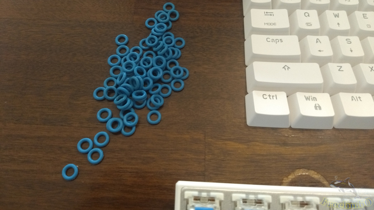
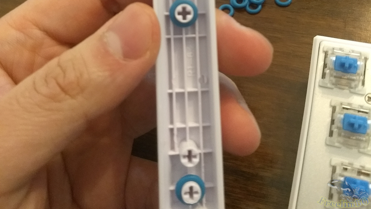
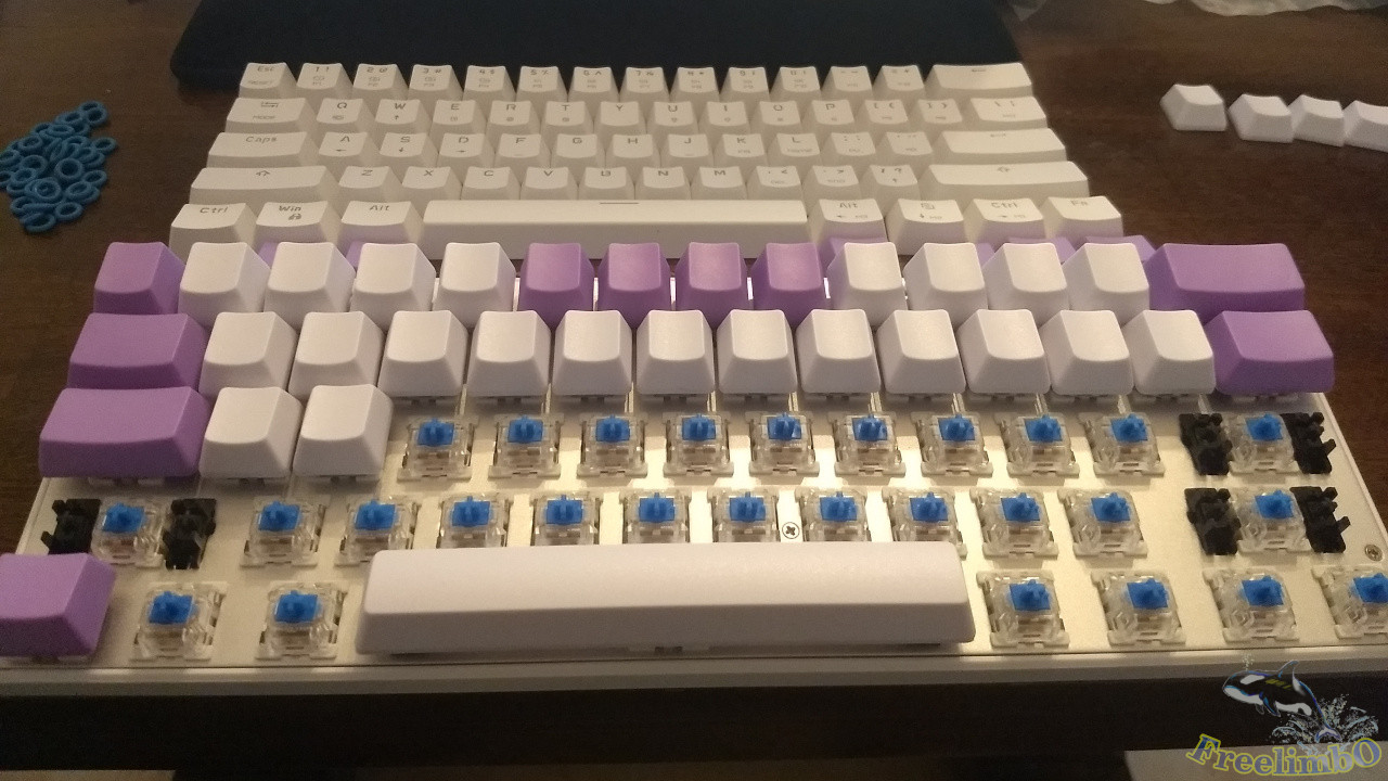
After using it for a few days, I found that not only was the mid-stroke click unpleasant to hear, but the bottom-out impact was also louder than my Cherry Blue switches. Listening to it over the long term felt a bit excessive. So, I decided to sacrifice some key travel to reduce vibration and noise by using damping rings. As luck would have it, my touch-typing practice keycaps (all blank keycaps) arrived at the same time, so I got to work.The top-left image shows a 40A-R 0.4mm O-ring shock absorber. The top-right image shows all 61 keycaps removed; the original translucent ABS keycaps will be stored away and not used for now.
|
|
| Installing shock absorbers on 6.25U long keys | Installing shock absorbers on 1U short keys |
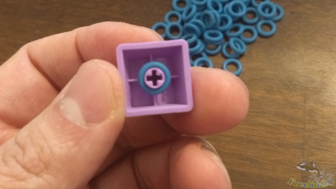
The first step of the process is to slip the shock rings onto the cross-shaped pins on the back of the keycaps. The top-left image shows the spacebar. I purchased this NPKC purple-and-white mixed pack, and the spacebar keycap in it is 6.25U long, which matches my keyboard layout. If you’re planning to do this yourself, make sure to check the length of your spacebar keycap before buying to avoid wasting time and effort if it doesn’t fit when it arrives.The image on the top right shows a standard key.
|
|
| Installing Shock Absorbers: Step 1 | Installing Shock Absorbers: Step 2 |
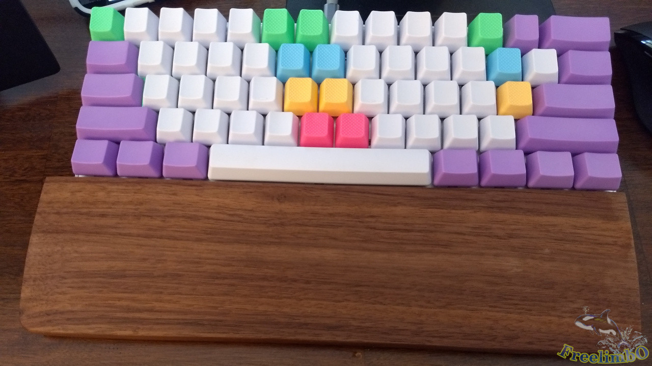
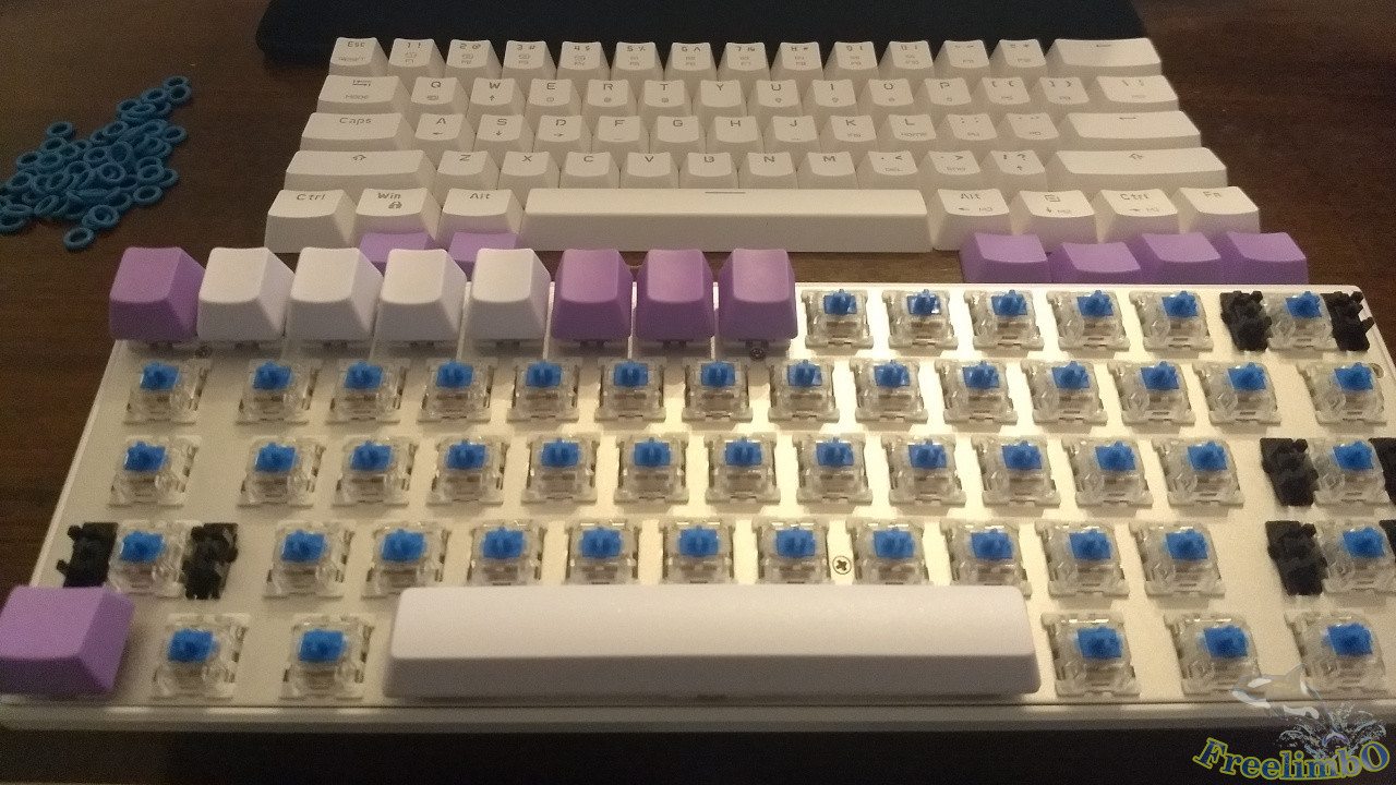
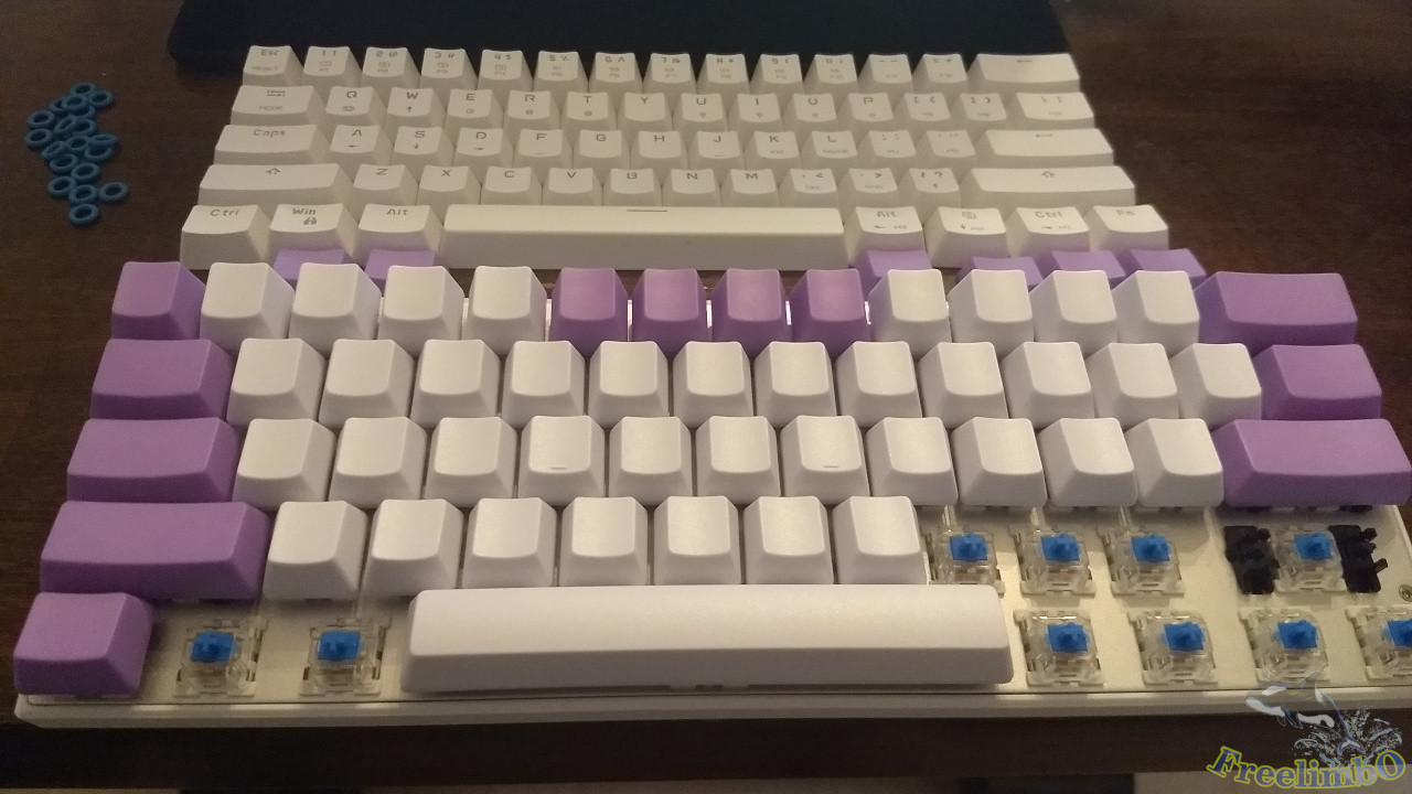
The installation process is like building with LEGO. Since there are no printed letters, the left-right order can be freely adjusted. For the R4 number row, I made the numbers 1–4 and 9–10, along with the symbols - and +, white, while using purple for the rest—this is also the color scheme recommended by NPKC. Next, continuing the installation…
|
|
| Installing shock-absorbing rings – Work in progress 3 | Installing shock-absorbing rings – Complete |
It was hard work, but I kept at it until all 61 keys were installed. One thing to watch out for is not mixing up the different rows. OEM-height keycaps have shape differences between R0 and R4, so they must be installed correctly to preserve the keyboard’s original curvature. This ensures that your fingers’ range of motion fits comfortably against the keyboard surface while typing.Looking at this finished blank keyboard (top right image), I can almost smell the aroma of taro balls. I feel exceptionally happy, and my work efficiency has improved as well.
|
|
| Using Scotch Bumper 1/2" spacers to aid touch-typing positioning | Close-up of touch-typing guide |
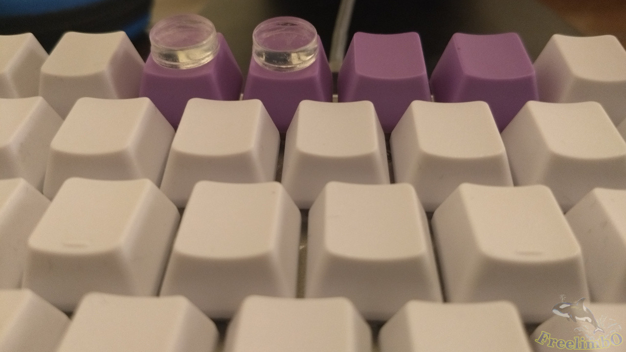
After using it for a few more days, every time I made a typo and looked down to sneak a peek at the symbols on the keyboard, I found nothing but a sea of blank keys. The only thing I could rely on was the symbol positions I had memorized.Before I knew it, I had become familiar with the symbols in the main key area. However, another issue gradually emerged during use: while the raised dots on the F and J keys in the R2 row provided good positioning, in the R4 row—where my fingers had to stretch to the limit—I often missed the mark when typing the numbers 5 and 6 or the symbols - and +, making it difficult to hit them correctly on the first try. So, I decided to use tactile feedback to help with these keys where I was prone to errors.
I used Scotch Bumper for this. It fits the surface area of the keycaps perfectly, has sufficient adhesive strength, and leaves no residue when peeled off—which is great for my peace of mind. I applied it to the 5 and 6 keys, as well as the - symbol. The added height allows me to tell whether my fingers have moved over these keys without having to look down at the colors or relative positions.
|
|
| OXO Electronics Cleaning Pen (Rubber Tip) | The other end features a retractable bristle brush |
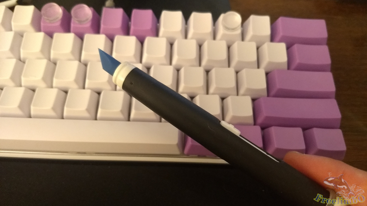
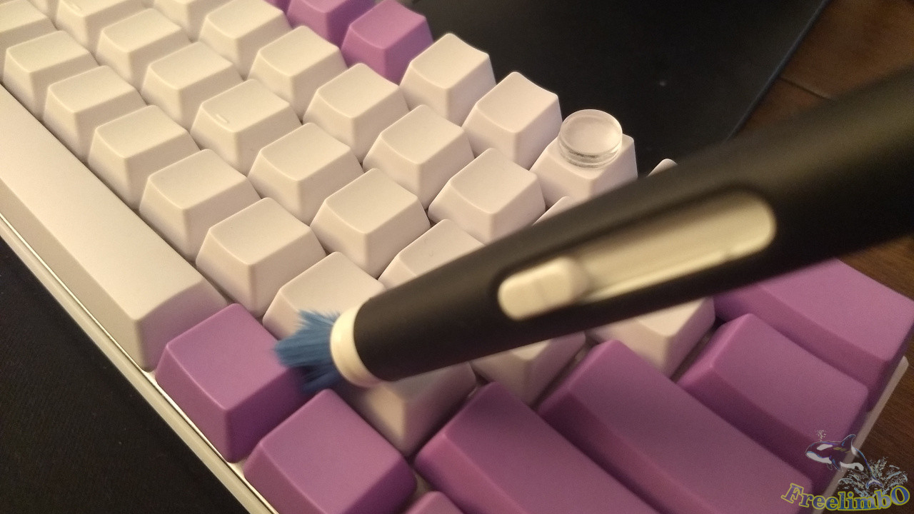
After using it for a few days, I noticed my typing error rate had decreased. However, since it’s a white keyboard, even a small amount of dust or hair stuck on the keys stands out unusually clearly. So I got myself a keyboard cleaning pen.The top left image shows the rubber end, which comes with a cap and can be used to scrape out dirt stuck between the keycaps. The top right image shows the retractable bristles, which are used to sweep away dust. It’s quite practical—I can even pull it out and brush around during boring meetings.
|
|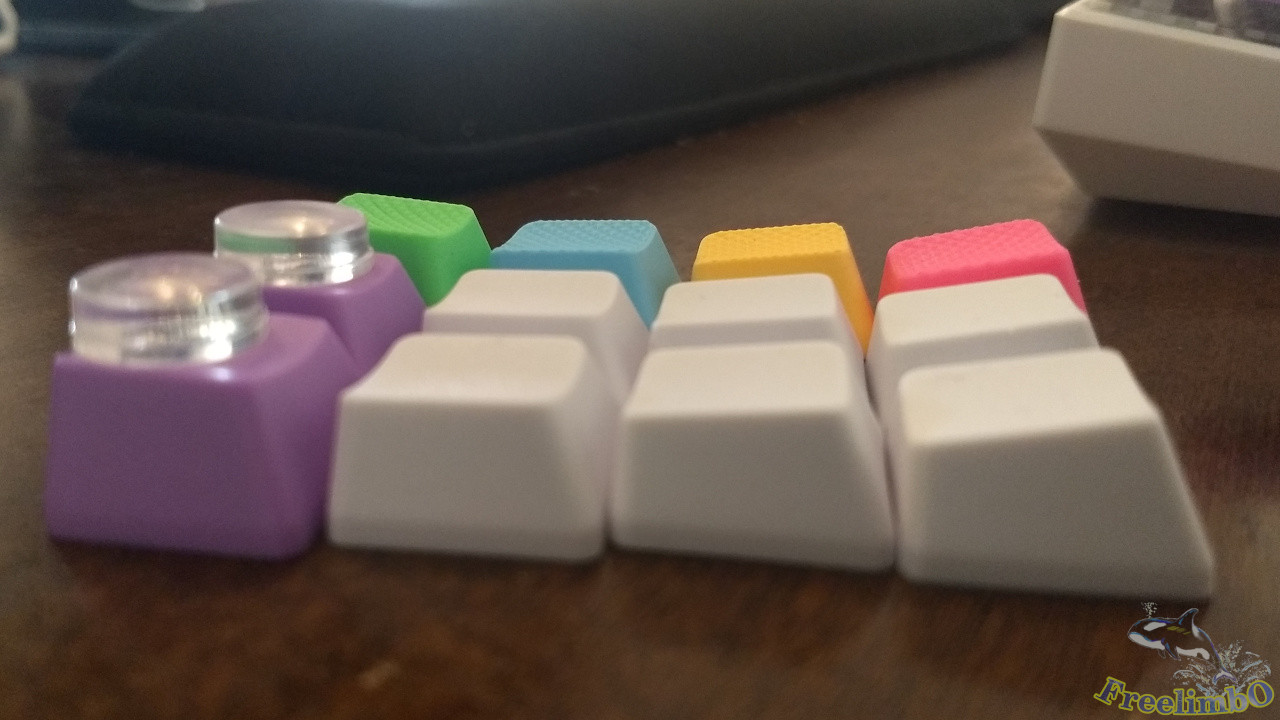
| Taihao Colorful Rubber Keycap Set | Keycap height matches OEM R4-R1 |
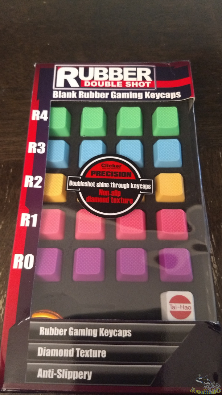
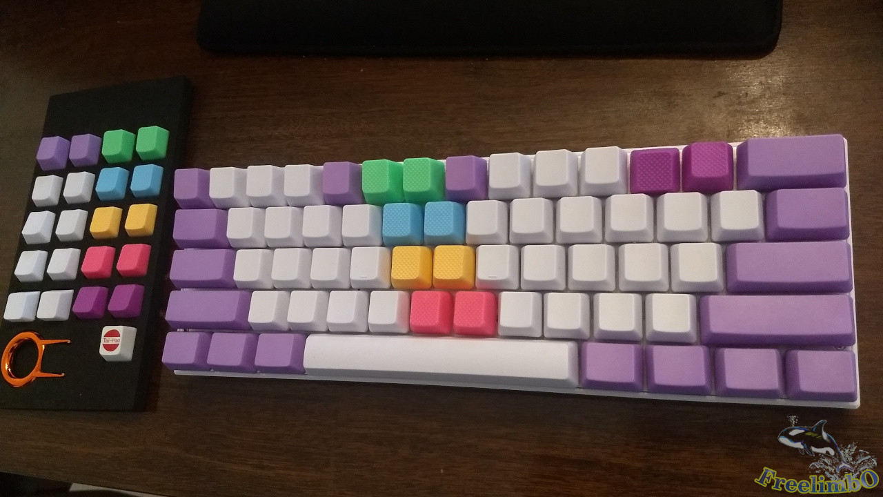
After using it for a while longer, I realized that since my previous keycaps were three keycaps taller, I had to raise my fingers slightly to avoid getting stuck. So, I searched online for a solution. I found that using keycaps with different textures might help me. Between metal and rubber keycaps, I chose the rubber ones.It’s said that metal keycaps, due to their weight, can affect the actuation force of the keys, making some keycaps easier to press down and leading to accidental keystrokes. Although metal keycaps offer a cool, metallic feel, I still opted for rubber keycaps, which don’t significantly impact the actuation force experience. The image on the top left shows Taihao’s colored keycap set. Basically, I don’t use the R0 row on my keyboard at all, since the R0 row—where the spacebar is located—consists of longer keys.
|
|
| Installing Taihao Colorful Rubber Keycaps – Work in Progress 1 | Installation in Progress 2 |
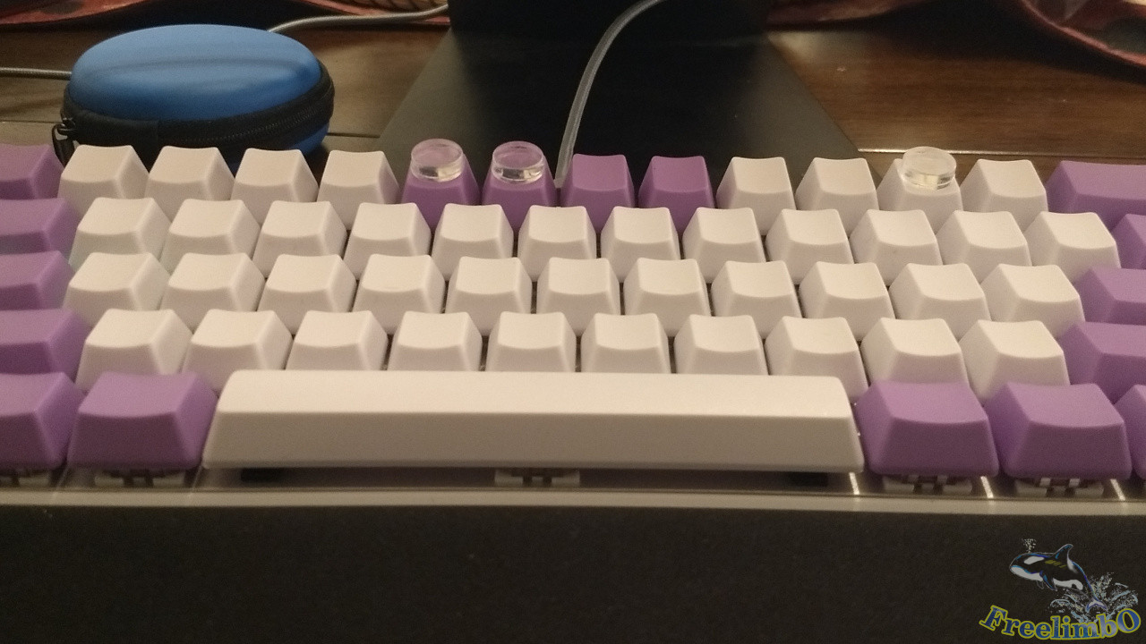
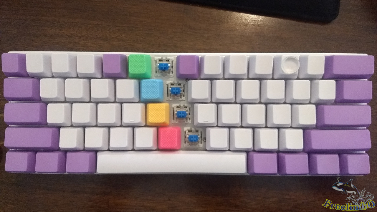
I began installing the rubber keycaps on the vertical columns for the number 5 and number 6 keys, as shown in the top-left image. As for positioning the - and + symbols, I installed the purple R0 rubber key upside down, as shown in the top-right image, to help align the top-right corner.To position the top-left corner, I replaced the Esc key with a rubber keycap. Observant readers may notice that the blank purple NPKC key in the center of the R4 row has been shifted one space to the left to secure the rubber keycap.
|
| Installation of Taihao Colorful Rubber Keycaps - Complete |
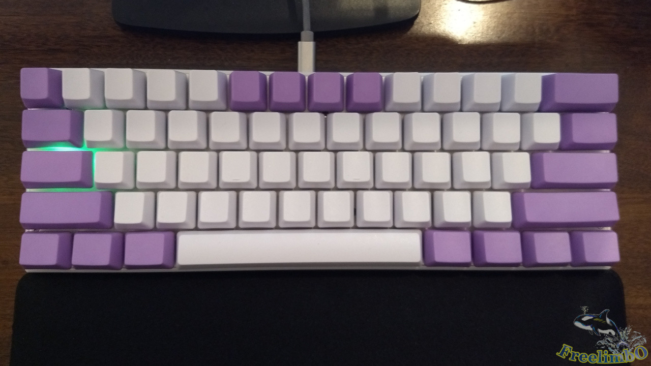
After using it for a few more days, I felt that installing the R0 key upside down for the - and + symbols still didn’t feel quite right.So I took out the remaining R4-R2 rubber keycaps to replace the - , [, and ’ keys. This allowed me to distinguish the four white keys in the left vertical column from the four on the right, aligning with standard English typing finger positions. I was quite satisfied with this setup, and I’ve been using this keycap layout ever since without changing it.
Some might ask: while a 60% keyboard like this saves a lot of desk space, can it really be used for a full day of office work beyond Vim coding? After all, you still need to use the arrow keys, Home, End, and other function keys in other software. Don’t worry—in the next post, I’ll explain what software I use to implement key combinations for highly efficient daily operations. Stay tuned.